Rae Beauty
Visual Identity | Print Design
Esthetics spa in North Idaho, offering facials and waxing services.
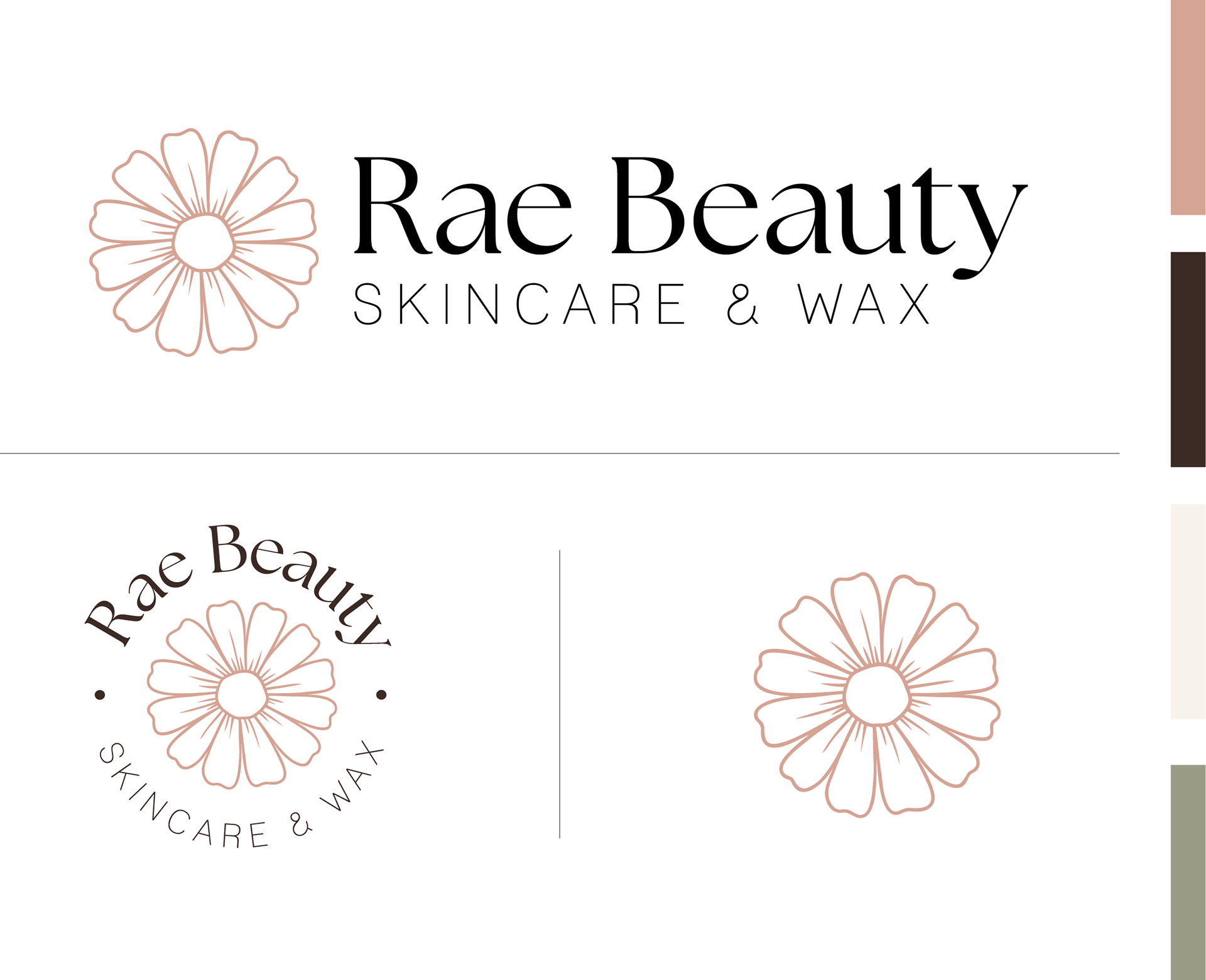
Visual Identity
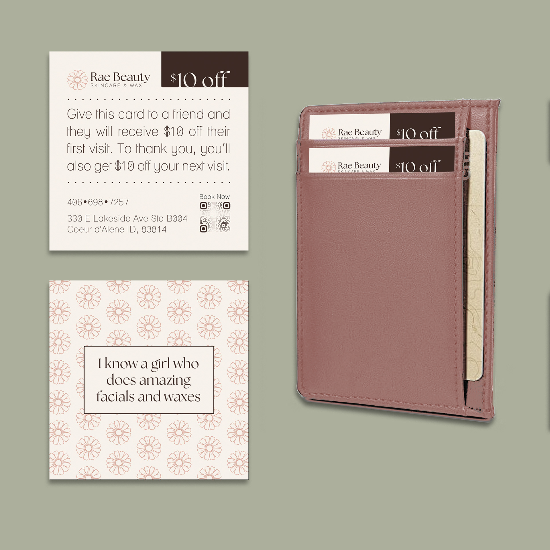
This visual identity leans into soft, muted colors to capture that calm, “treat yourself” feeling you get from a good spa day. The daisy logo adds a personal touch, inspired by the owner’s favorite flower, and the soft, muted tones bring in a feminine, welcoming vibe that ties everything together.
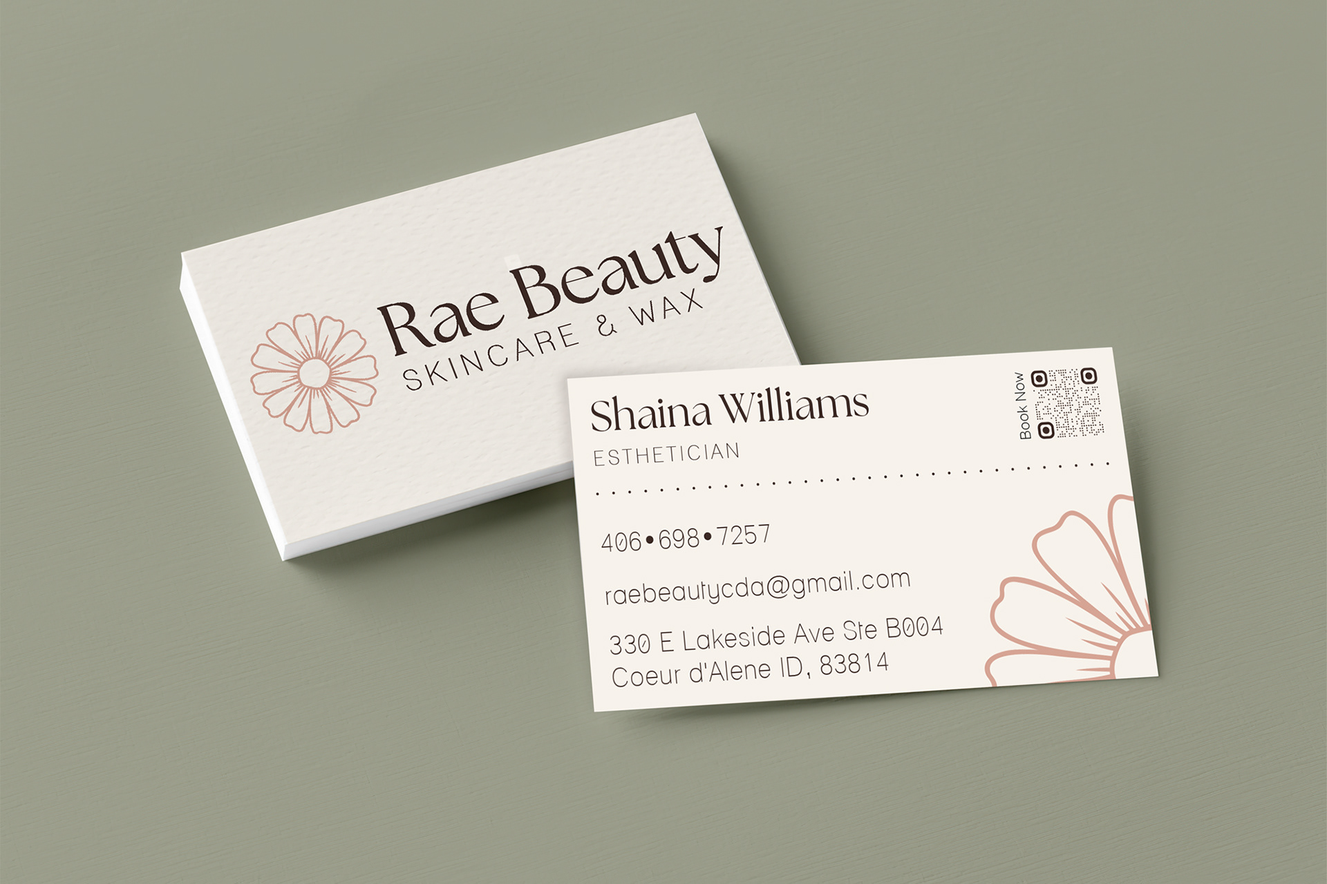
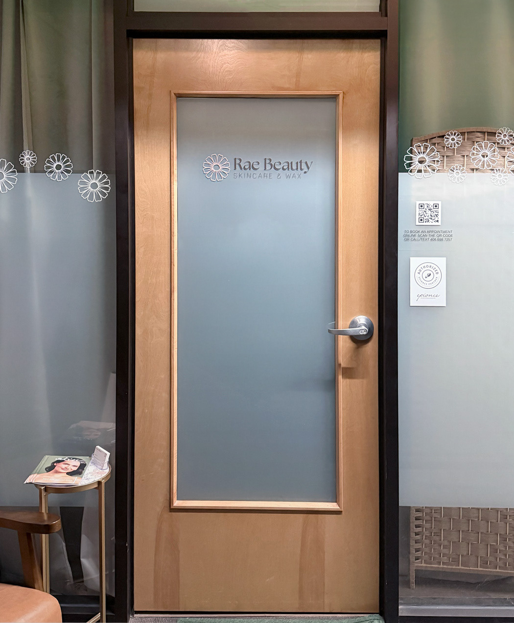
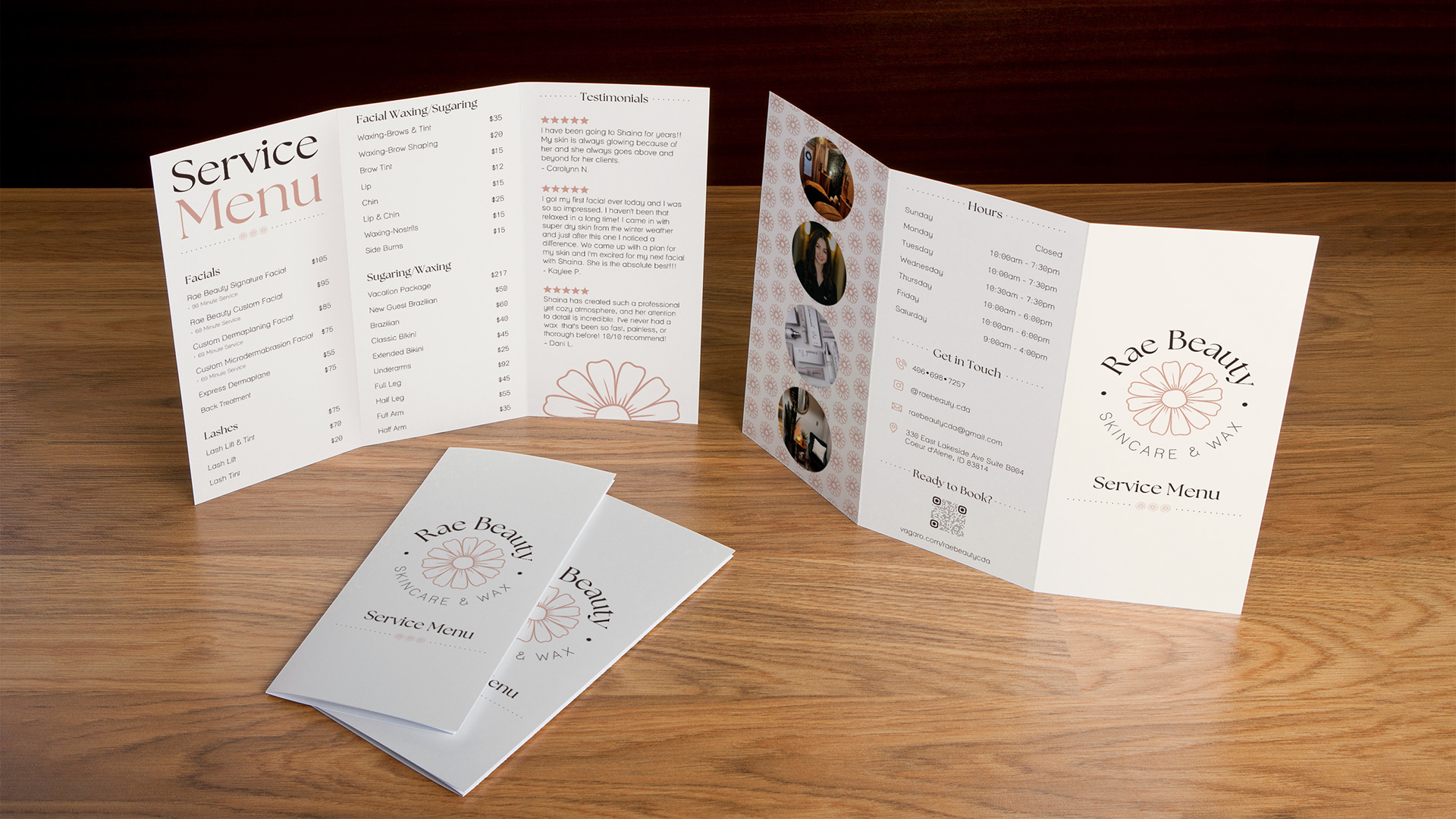
See it in action
The final pieces bring the brand to life. Each piece features a soft pink palette and daisy elements, maintaining a clean, feminine, and consistent aesthetic.